Summer is a time for leisure, vacations and work pace is slower. DataFromSky did not completely sleep, though. Two new functions of the Viewer are now available!
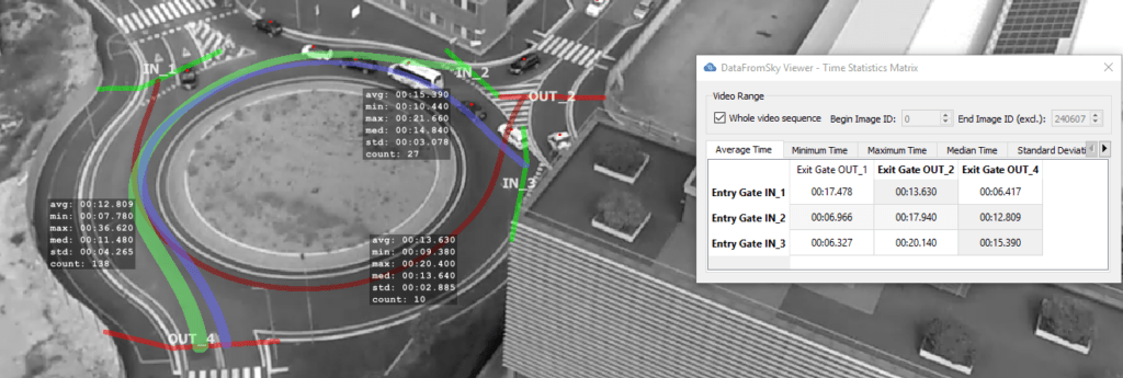
This function is a generalization of origin-destination matrix. For an O/D matrix you need counts. DataFromSky can give you more, though: Instead of just counts, we also offer timing statistics – minimum, maximum, average and median plus standard deviation.
The Viewer got a new dialog for this. It shows a matrix of gates, and tabs for the various measures. When you select a cell, the pair of gates is highlighted as well as the path that vehicles take. If you select more, the highlight colours vary. This way you can easily look at the timings and see what belongs where. If the displays in image overlap, no problem – just drag them where they do not bother you.
Track colour by direction
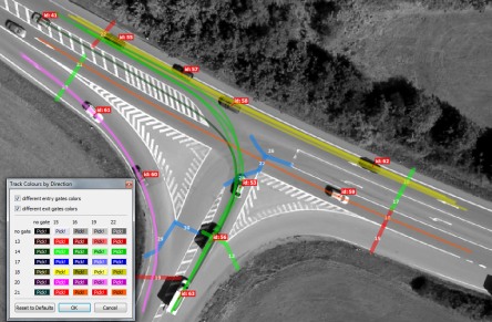
The second new feature allows you to visually discern what paths vehicles take, too. You can now set individual tracks (trajectories) to be coloured according to entry and exit gate combination. Thus you can easily see where a given vehicle goes, and if you select the non-present tracks to be visible, you can even see the paths all of these vehicles collectively take.
With the direction colouring, this allows easy inspection of eg. lane utilization.
All of the colours can be configured – you can even customize the display to your company brand colour scheme, if you so desire, for images to be included in reports.
We hope you like both of the new additions. We have an endless list of things that can be added or improved, so expect more to come – and keep watching us to learn about more of these exciting developments!


